The Sol LeWitt Principle
Lyn Horton
September 2016

On April 8, 2007, Sol LeWitt passed away.
With him went his ever-engaged mind; the seeds of creativity which took him from one drawing, one sculpture, one photograph, one word to the next with seeming ease.
In 1968, he created his first wall drawing at the opening of the Paula Cooper Gallery, a gallery which still represents his work.
Sol’s Paragraphs on Conceptual Art were published in Art Forum magazine in 1967. Sol’s Sentences on Conceptual Art were published in New York’s, 0-9 in 1969 and in England’s Art & Language in May of the same year. Written with respect to his own work, manifestos for his own art-making needs, these words reached Biblical applicability to art of the time very quickly. He never claimed to be the Father of Conceptual Art.
Eadweard Muybridge influenced Sol. Below is Muybridge’s exemplary contact print of the Cockatoo in flight. It makes perfect sense that Sol might understand the logic and inevitability of change from one photographic frame to the next. At the same time, Sol recognized the sameness as demonstrated by his own early video piece of a nude woman, who has no identity, walking toward a camera frontally with no shadow, no angle that hinted at dimension. Only white was behind her. His nude stills of a woman walking forward implied the same kind of stop action movement.
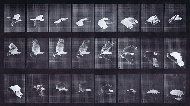 Eadweard J. Muybridge. Cockatoo Flying: Plate 762 from Animal Locomotion. 1884-86
Medium: Collotype; Dimensions: 7 13/16 x 14 1/4″ (19.8 x 36.2 cm)
Sol’s reputation evolved out of his invention of spare simple formulated systems applied to many contexts. Sometimes seen as minimal art, his cube sculptures qualified then and still do as a reason for being themselves. He made them at first on an extremely small scale; he glued the struts together and painted them. Like any artist, he worked within his means at the time; he confessed once that he did not have much money.
His drawings were also concerned with formulated systems for which he eventually could make instructions so that he could detach himself from them; he could also mold the same drawings to different surfaces depending on how he envisioned the surface being used. He could expand his imagination of his imagery, his ever-changing vocabulary. This is the point at which the drawings leapt to the wall.
Although almost uncountable exhibits of his walls drawings have occurred, the 25 Year Retrospective of Sol’s wall drawings, which opened on November 16, 2008, at MASSMoCA, North Adams, MA, is exceedingly special. It was the result of several years of planning through the collaboration of a group of organizations (Yale University Art Gallery, Williams College Museum of Art, MASS MoCA) and Sol, who designed the placement of the walls and the placement of the drawings using a small model. The exhibit absorbs three floors of one building of the huge MASSMoCA complex; the building was renovated exclusively for the show.
Given the nature of the concept of the wall drawing, Sol birthed a wealth of possibilities or ideas within the concept. The exhibition at MASSMoCA offers a selection from the over one thousand drawings for which he has created instructions.
The instructions for Wall Drawings fit into the context described by one of his sentences on Conceptual Art:
“28. Once the idea of the piece is established in the artist’s mind and the final form is decided, the process is carried out blindly. There are many side effects that the artist cannot imagine. These may be used as ideas for new works.”
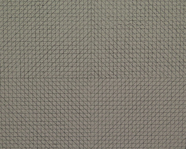 Wall Drawing #11, 1969, detail of exact center
Wall Drawing #11, 1969, presents itself at the entrance to the first “Early Work” floor of the three floor exhibit. In appearance, the graphite (always pencil #9H) wall drawing seems flat, even and uneventful. Then one’s eyes adjust and the intrigue is unavoidable. The closer one moves towards the wall, an entire world of detail widens to reveal itself. The viewer cannot possibly take in the whole drawing on the same level of detail. The instructions for this drawing are simple (as are they all): “Wall divided horizontally and vertically into four equal parts. Within each part, four kinds of lines (in four directions) are superimposed.” The size of the wall for this drawing can vary. But its ownership cannot, as is true for all wall drawings. This particular set of instructions, when applied in various forms throughout his career, became his signature by default.
Flanking the first drawing is a multi-sectioned one using color pencil leads and graphite. The directions for this one are as elemental as those for #11, but the patterning changes. The regularity of drawn lines creates an unpredictable, unexpected pattern formation, which transforms the drawing into a study of texture, arising purely from the commitment to process. The way in which the wall is divided into each section, where the combination of pencils and the directions of lines change, like the blink of eye, alters the way in which the lines are perceived.
“24. Perception is subjective.”
Each individual wall drawing propagates another. Turn the corner and the textures, patterns, density of lines modify the flat surfaces.
Walls. These are walls.
On another wall, four vertical columns of graphite lines are separated by four inches. Adjacent to that six vertical columns, sharing the same edges, using color and graphite lines in overlaid diagonal and vertical and horizontal directions, adjusts the perception of the wall drawing where columns are separated. One drawing strengthens the other. The aesthetics don’t matter. The impact does. The Zen of them matters. That they embrace the viewer is celebratory.
Each floor of the exhibit is L-shaped. The areas are arranged so that at least two, considering both sides, are the longest continuous area for display. The remaining walls are divided and, as a result, intimate spaces are created. On the latter walls, the repetition is not the endgame. But the longer spaces where larger walls stand explode with beauty, subtlety, and paradoxical tenderness. Somehow repetition is comforting. Even though each part within the repeated group of units is different from another, the core units are based on the same principles. So the repetition simply seems like it happens, although it actually doesn’t.
Evolutions. Evolutions. Evolutions. Unfolding imagistic poetry.
If one wanted to talk permutations, one could. A permutation is a word for analysis rather than appreciation.
“11. Ideas do not necessarily proceed in logical order. They may set one off in unexpected directions, but an idea must necessarily be completed in the mind before the next one is formed.”
Not straight vertical lines approximately 10” long equal rain.
The adjacent drawing of randomly crossing graphite lines is like ice.
Crystalline hard form cracking next to a gentle purring slipping of water against glass.
Graphite or colors: red, yellow, blue.
Alternately, from wall to wall, the potential for intimacy becomes an explosion of controlled expressivity. Why not? Turn the lines into vectors, use a different material, undo and strengthen what has already been discovered. This is the drive of the artist whose mind is unfettered, who applies no bounds within the boundaries he sets. Whose art speaks to him and tells him where to go next, what to do next. And whose heart is so large that accommodating a relentless switching of gears might be troublesome at times but never ceases to be grounded and shaped and dealt with as viable direction, both literally and figuratively. (Sol would have said those last four words.)
The model for the retrospective is so small; perhaps 30” wide x 36” long x 10” deep, in three parts, one for each floor. The actual rooms though are oriented to the human body. Sure the walls are ten feet tall to accommodate the ready-made floor to ceiling height. It doesn’t matter that the walls aren’t any taller. The constancy of image requires an input of humanity in order to be ingested. Not being able to reach the top of a wall does not mean that the size of the drawing is meant to be overwhelming. It is merely a means to lay out the combinations in full swing (Sol would have that) so that the surprise of pattern is blatant and the drawing becomes a dance rather than one image idea next to another.
The colors of the walls metamorphose as do the impact of the instruments using to draw give punch. An inexplicable extroversion abounds, espousing a belief in the wonder of the line as surpassing the necessity for maintaining a kind of “technique’. It is laughable to put Sol’s capacity for using line in the same sentence as technique. The power of the use of process and idea render technique an antiquated term.
“19. The conventions of art are altered by works of art.”
Logical moves: pencil to crayon to pencil again.
What was learned with the tools is reflected in the change of image.
Which is, in toto, his vision, only visible when the total work is seen in toto.
“20. Successful art changes our understanding of the conventions by altering our perceptions.”
The utilization of the wall is complete no matter whether the idea calls to use marks on the entire wall or pull away from the edges of the wall. The emptiness is as important as participation. The emptiness allows the image to be framed. The frame is in proportion to the image. It is all measured. It is all intuited. It is all felt.
When the thin pencil lines expand outwards, the patterns expand. The distance between the viewer and the image can be greater for detecting the overall patterning made with repeated gestures. All measured, all regulated, all designed, all felt. Close up the expanded pencils lines never retract into old patterns. Ain’t no way. Because a new drawing has arisen.
“21. Perception of ideas leads to new ideas.”
Expansion and contraction become thematic hinges throughout the pencil drawings. The fluctuation creates a means for occupying the spaces between the lines (Sol would have said that) to push through even adjustments towards larger and larger graphic explosions.
Grander statements.
None more important than the ones that came before.
Ink and paint added to the collection of artist’s media.
Layers of pencil, layers of ink.
Coincidental principles of applying them.
“27. The concept of a work of art may involve the matter of the piece or the process in which it is made.”
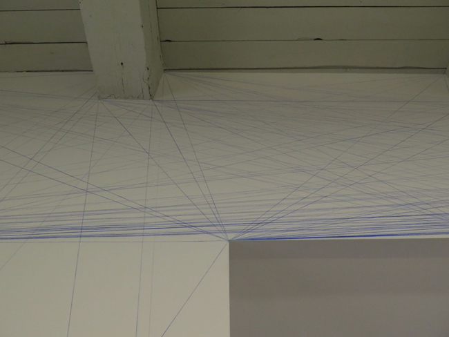 Wall Drawing #51, 1970, detail
The later pencil works developed into designs of other shapes. Strange aberrations within the whole yet evidence of the willingness to stretch and loosen up and unwind, even though the lines are straight, overlapping. And true to a source of form. Sol’s early drawings went through a mannerist phase when he verbally described placements of lines and/or points on walls and those words were written where the lines and/or points were placed. This perhaps is the beginning of the development of his concept of shape, isolated shapes on walls and shapes derived in relation to points on walls.
The media for drawing shapes were the same as the ones for drawing lines. Shapes were just shapes. Yes, the emptiness was filled with emptiness or crayon. But the shapes were a way to separate out the geometry illuminated by the linear analysis of architectural points as in the early chalk drawing, #51. This was a part of his training. Yet, when he stepped out of the geometry of architectural training, he was in a zone where his spirit spoke more than his knowledge.
The bases for his entire oeuvre exist on the first floor. One can see the way visual ideas penetrate all stages of his work. His vision is only visible when the total work is seen in toto. This is the reason that grasping the pencil wall drawings from the earliest period is vital to understanding the remainder of the wall drawings. And it is especially important given the way that his work is laid out in this museum context. This retrospective is different from any other.
The influx of ink as a medium was significant in his growth out of pure line. He covers more area more quickly. He layers the ink to produce colors that are produced from RYB, yet become expressionistic. A secondary palette: purples, greens, blues arriving from a logically processed palette. Seemingly less regulated. More free. More in tune with a world where the self blooms through doing what one loves.
“25. The artist may not necessarily understand his own art. His perception is neither better nor worse than that of others.”
The next step in Sol’s image making, when the ink-wash shape-oriented drawings began, the architectural space is stretched and emphasized by the natural expanse accompanying the drawings in it. The drawings become bold statements rather than invitations to move in and examine the details, even though one does.
In this exhibit, the way in which the specific walls are arranged on the floor make just as much sense, if not more sense, than the basic spatial structure of the building. Even the lighting, thought it has been criticized, makes sense. The floorboards and the long florescent tube lighting are perpendicular to the verticality of the walls on which the drawings are. The windows magnify the regularity of the drawings and become a backdrop for the exquisite color performance in front of them, a backdrop for the play whose characters are the drawings. The results of the physical motion of installation emanate from the drawings. The ambient sounds, such as distant sound art, people talking, foot falls on the floor above or on the stairs are enough to offset the quietude that the wall drawings project. Although Sol likened his work to the music of Bach, especially early on, and no doubt he played music when he was working, no music comes out of the drawings. Only meditative silence.
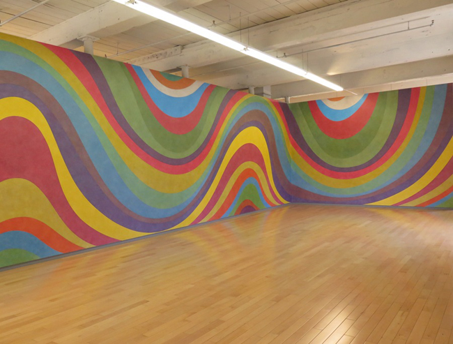 Wall Drawing #793b, 1996
The third floor display, dealing with Sol’s Late Period, is replete with painted shapes. Paint cannot be washed over in layers like ink can be. The acrylic paint is placed in separate shapes. The first wall drawing seen upon entering the floor is a mixture of the various shapes that he has used throughout his art making career: arcs, rectangles, concentric circles, curves (or not straight lines) which form saw-tooth edges against rectangles on a third or so of the wall. The colors employed here are exuberant, bright and overwhelming; ready to be seen at close range and at the same time only appreciated at a distance. Perpendicular to this wall is a wall drawing of a yellow isometric shape, whose sides are painted with green, blue and red. The shape lies on a field of orange.
One cannot sit and appreciate these for long. The tendency is to want to move on. There is nothing to contemplate. The world is loud.
The flip side of the opening wall is the totally enveloping black and white “Parallel Curves,” #999, 2001. How extraordinarily expressive and free this drawing is in contrast to the multi-color collective wildness on the wall’s other side. The rigor of the curves translates into constrained shapes which simultaneously flow, move and melt into one another. This drawing’s intent seems to be closely derived from the pencil drawings of his early period, without borders but truly restrained. The curves on the upper edge leave the surface; on the bottom edge, they create new shapes.
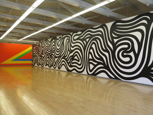 Wall Drawing #999, 2001 (right) and #1005, 2001 (left)
Opposite these curves is the quadri-color “Splat,” #958, 2000. It is longer than “Parallel Curves.” It mixes straightness and fluidity on uneven terms; one does not know how to understand its makeup except perhaps in terms of a map, or of earth, air, water and fire. Our earth’s core.
As the dates of the pieces change, the treatment of the themes changes in size and approach. Iterations of original pencil drawing of four squares; lines in four directions in four squares, for which he is the most famous, appear: lines make the shapes, the shapes become the color and the colors become the shapes.
Singularly outstanding is an absolutely elegant single curve that divides the wall on which it is drawn into two distinct shapes. The upper is painted in black matte and the lower in glossy acrylic paint. One surface conveys two messages: absorption and reflection. Polar opposites. Simplicity and depth. Wholeness and duality. Calmness of yin and yang without the disparity of this side and that sharing a common edge. Sol’s Yin and Yang. Opposite this is a set of twelve “Wavy Lines” painted with the same medium: the curves are horizontal, vertical and diagonal, activating forty inch squares with the same kind of two phase blackness, the same kind of unity.
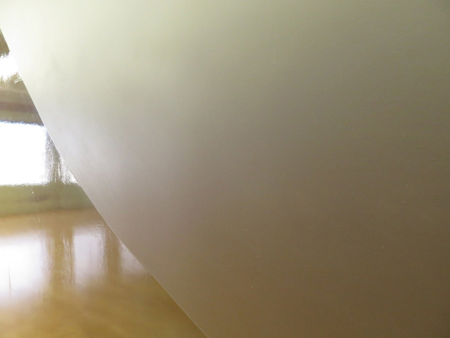 Wall Drawing #822, 1997
And then beckons the grandeur of the 1998 “Loopy Doopy,” Wall Drawing #880, the drawing that was opposite the elevators at the entrance of the Whitney Retrospective in 1999, where the colors used were purple and blue. At MASS MoCA, the variation is green and orange. Loopy Doopy, as the name implies, hints at Sol’s humorous side.
Imagine the glimmer of a smile on his face, for instance, when he would say to someone in a conversation: “Drop me a line sometime.”
The similarity that “Loopy Doopy” has with “Parallel Curves” exists; but, in a way, the curves are less serious, more freely drawn, less introverted.
Behind “Loopy Doopy” are two drawings that are the logical step from the ones that are contiguous with this section of the room. One is a black matte and glossy version of the four squares with lines going in different directions. Adjacent is a three sectioned piece: a horizontal curve, vertical curve and diagonal curve separate each of three large individual squares into primary colors paired with their opposite or secondary colors.
The conclusion of the exhibit is at the back of the “L” on the third floor. The bright color wall drawings are concentrated in the center of the floor’s layout. The colors move within bands, planes, squares, whirls, twirls, isometric shapes with the glaring characteristics of regularity and irregularity. Blasts of pure color, repressed subtlety: extroverted statements that speak of everything that is possible in Sol’s language.
There seems to be a search for solace in the content of the painted work.
Until the deeply introspective scribble drawings appear. They are dated towards the end of his life; some of them were installed posthumously for this retrospective exhibit. The scribbles are so dense one cannot see any unmarked area, except on close inspection between each scribble, which move from the outside in; within the same drawing, the least density of scribbling creates the center. One can see white, but never pure white. The scribble drawings glow. Shine. Become. Concentric circles within a square. Horizon within a square, vertical tension within a square, square within a square with rounded corners, an “X” within a square and one that echoes the ink wash drawings where isometric shapes are elicited: this drawing is executed like the ink washes with one layer of scribbles occupying the entire wall and succeeding layers of scribbles inscribed into overlapping shapes.
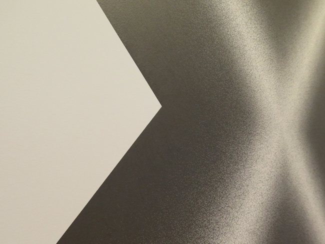 Wall Drawing #1247, 2007
The last drawing on view, #1180, is the perfect drawing. In a circle that is approximately ten feet in diameter, in the perfect center of the rectangular end wall, it retreats from the edges, but pushes simultaneously at the top and bottom of the circle. The directions: 10,000 black straight lines combined with 10,000 not straight lines.
10,000 means “many” in the Oriental sense of the word.
Black and white, the absorption and reflection respectively of all color.
Here are essential elements: Lines. They were the perpetual subject matter of Sol’s life’s exploration and adventure. The lines coalesced into geometry which he managed through the juggling of more lines. Lines were the beginning and the end. They were continuously present as the circle is round.
“1. Conceptual artists are mystics rather than rationalists. They leap to conclusions that logic cannot reach.”
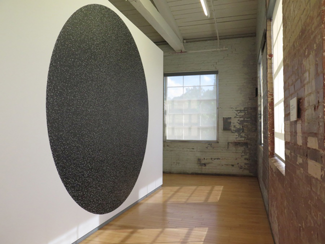 Wall Drawing #1180, 2005
The Lines.
The Lines were his close friends.
The Lines were his allies.
The Lines travelled with him wherever he went.
The Lines led Sol everywhere.
The Lines empowered him and spread omnipresent creative energy throughout the universe.
Copyright 2016 Lyn Horton
Photo credits: Lyn Horton
