Repetitions
Kurt Novack
February 2014
Observe…Process…Expound upon your conclusions…Repeat!
Examining van Gogh’s work process in order to shed light on understanding real versus counterfeit
van Gogh Repetitions, The Phillips Collection, Washington D.C., Oct 12, 2013-January 26, 2014
An exhibition examining van Gogh’s habit of revisiting themes over the course of his career. Included along with a sampling of van Gogh’s work was a selection of work by some of his favorite artistic predecessors, as well as work by some of his contemporaries.
Vincent van Gogh is commonly accepted to be a ‘great’ artist. Though he sold essentially nothing during his lifetime, he lived for his art and worked at it incessantly during the short amount of time that he was active. While he clearly took his work personally, at the same time he was able to look at it dispassionately, as evidenced by his work process. This exhibition endeavored to show how his secondary (and subsequent) attempts at particular themes were based on analyzing his first attempts. Van Gogh was known to have possessed well-considered aesthetic aims informed by a considerable knowledge of art history, and multiple versions of various themes show him tinkering with composition, quality and direction of brushstrokes, intensity and hue of colors, and style in general.
One of the main reasons I was interested in attending this show was to muse upon the idea of counterfeit art as defined by Tolstoy. Would there be evidence of a reduced quality as van Gogh made his way through various versions? Would succeeding versions show evidence of a lack of sincerity or some other indicator of a reduced ability to “infect” viewers?
Finally, as a van Gogh fan (though 80% of his work I find of questionable quality, the top 20% really speaks to me), would I be biased in my response to this work? Should we allow ourselves to lend more credence to the initiatives of a well-known and critically acclaimed artist than we would to an unknown?
The answer to this last question is “No”, of course. However, examining work I was predisposed to like did make it easier to try to penetrate the motivation of artists in general, and made it easier to drag myself through what was, in the end, a relatively dry and academic show.
***
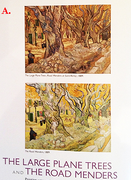
Entering Repetitions, viewers first encountered two versions of an image of a tree-lined street, with a road under construction in the foreground of the painting [Fig. A]. In the background are a few houses and some people walking by, going about their business. The brushstrokes were rougher and the colors were darker and less immediately appealing in the first version, The Large Plane Trees, which was painted onsite. The second version boasted brighter colors and a more classically perfect composition and was painted in the studio. While The Road Menders is the title of the second version of the theme, the menders themselves are barely visible in the middle-ground in both paintings.
It is interesting to note that of the two versions of this theme presented in the exhibition, my 8-1/2 year old son and I both agreed that the first version was better. Looking at the illustration (attached) of both works, this is counter-intuitive, in that the first one looks a little dull and unresolved in reproduction. I guess you had to be there.
And oddly enough, one of the first things I noticed was how effectively The Large Plane Trees was framed. The three large trees which form the central focus of the painting are cropped at leaf-level at the top of the painting, at which point the ornate and 3-dimensional frame effectively extends the imagery of the painting and forms a canopy over the painted scenery. I really felt like I was walking along the street underneath the trees while looking at the painting. I did not feel the same way while looking at version #2. While I doubt that Van Gogh selected the frame himself (I saw nothing in the signage to suggest this) I was nonetheless impressed.
This third-party-directed presentation suggested a metaphor for how the field of aesthetics works: it frames and focuses one’s understanding of art. While chronologically secondary to the creation of the work in question, it is a sign that the artwork is doing its job. When people are interested enough in something to hang it up on a wall and initiate a conversation about it, aesthetics is the language of that conversation.
***
When a great artist makes copies or secondary impressions of an original idea…is it counterfeit art?
Quick answer, no, presuming that, as was the case with many of van Gogh’s second and third versions, he was really taking the original impulse in another direction and aiming to create something different. The viewer may not like the secondary versions as much, but it is hard to quarrel with their status as legitimate art.
My experience has been that sometimes you need to make a couple of attempts at an idea to achieve what you want. Presuming one works equally hard at each, chance seems to enter into the equation as a factor in predicting/determining quality.
[Ed note: this understanding allows one to appreciate composer John Cage’s rationale and modus operandi a little more.]
What if a great artist makes what appears to be a rote copy of a previous work?
Well, yes, the work might be considered counterfeit, especially if it was created simply to make money. However, there are a couple of variables here. If the ‘copy’ appears effective as an artwork in its own right, then there is no reason to assume that the artist didn’t put the same amount of effort into it as he/she put into the original. To some extent, artists are actors, inhabiting an idea and believing it just long enough to execute a particular work. Consider the situation where two takes might be needed to record a particular scene in a movie, for example, if a cameraman spilled an otherwise perfect take. The actor’s art requires him/her to invest the same effort and feeling into the second take. Is the second take a copy? No, it simply becomes ‘the’ take.
Also consider a situation where, regardless of the artist’s conscious motivation, his subconscious motivation to create great art combined with a native work ethic and practiced skill wins out and supersedes. In the act of ‘cranking one out for the bucks’ he creates another masterpiece. It has also been my experience when looking at copies that some are better than the originals. Again, chance probably plays a factor.
***
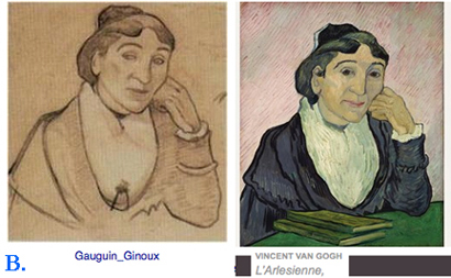
Another interesting juxtaposition in Repetitions placed a van Gogh painting of cafe owner Madame Ginoux next to a charcoal drawing of her by Paul Gauguin (Mme Ginoux owned a cafe across the street from Gauguin and van Gogh’s joint studio and visited the studio to sit for them on Nov. 4, 1888). The Gauguin drawing was created at the sitting, at which time van Gogh painted a different composition of the subject, as he was sitting more to the subject’s side. The van Gogh painting installed here [Fig. B] was based on Gauguin’s drawing rather than his own original painting, and was made two years later.
To my eye, both are lively and highly successful works and it is hard to believe they were not executed by the same artist. Other than the books on the desk in front of the sitter, the only iconographical difference between the two appear to be the positioning of the pupils. In Gauguin’s original, Mme Ginoux appears to be looking to her right (perhaps deep in thought) whereas in van Gogh’s version she is looking directly at the viewer, or perhaps in van Gogh’s mind, looking at the artist painting her. Interesting to note that this adjustment is pure invention as, again, it does not depict van Gogh’s vantage point on the day of the sitting.
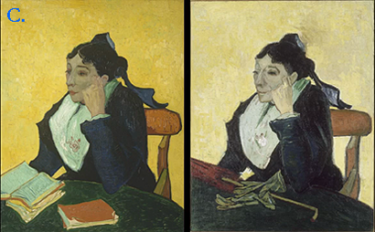
Is one better or more real than the other? Well, considering them as independent artworks, coincidentally sitting side by side, I found them equally great. Both had a presence that transcended mere illustration and projected some kind of brooding, emotive power. It is interesting to note that a few versions of van Gogh’s original composition were also on display [Fig. C.] and I did not like them or find them particularly absorbing.
So did van Gogh agree with this assessment, and so create his own version of the superior composition, unoriginal as this idea might seem? Maybe yes, maybe no. It could be argued that for van Gogh to create a version as powerful as Gauguin’s, he had to be an even stronger and more original artist, as he had to be able to imbue his apparently imitative work with the power and unconscious directness of an original work. This required rising above his immediate circumstances and throwing himself wholeheartedly, both intellectually and emotionally, into the later work. Challenging work for a guy whose whole oeuvre is characterized by ‘directness’.
***
One gallery in Repetitions was devoted to the work of van Gogh’s friends, contemporaries and forebears. Rembrandt, Daumier, Delacroix were represented in the latter category, and the selected work emphasized loose and lively drawing and painting (no tight rendering here). This made sense as it is well known that van Gogh worked fast, once he decided what he was doing. His technique seems to service a belief in animation and sprightliness as the most effective way to represent the human condition. Directness and rough mark making clearly didn’t originate with van Gogh. So is he an imitator? No, everyone has to start somewhere and besides, no matter what you do, your work is likely to fall into a broad category of work that includes other artists’ work.
The work of Millet, perhaps the most well-known influence on van Gogh, was also displayed. van Gogh made copies of some of his work, several of which seem be studies executed in order to understand and absorb his approach to composition and subject matter, others more mature ‘repetitions’ executed for reasons similar to the reasons he created his later Gauguin-inspired work.
So if van Gogh in a large part assumed Millet’s approach to subject matter as his own, is this another reason to question his originality? Well, what is originality anyway, if one considers that cultural products and techniques are a product of evolution, just like species evolve based on minor adjustments in the gene pool over time? Perhaps an artistic original is anyone who imbues a strategy within their work with enough panache and life-force that it allows viewers to forget that there was a strategy. Given this reasoning, originality, misconstrued as referring to technique, should rather be defined as an ability to be true to one’s origins or personal/cultural make-up. We can incorporate a questioning of the status quo within our work, but we can never escape what we are. Art’s mission is to expand our understanding of what we are, not to change it.
***
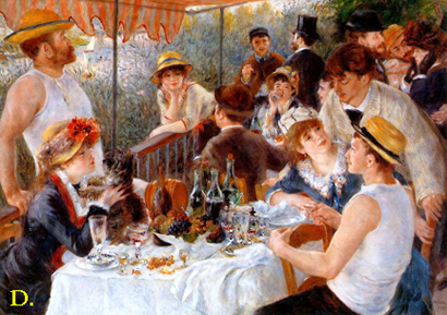
Re: Luncheon of the Boating Party, Pierre-Auguste Renoir, 1881, a large oil painting on view at the Phillips Collection
Since I was at the Phillips anyway, I took a quick walk through the collection. This painting was touted as one of their hallmarks and was surrounded by crowds every time I walked past it.
While great art is expected to communicate universal values, we simultaneously require of its maker that it be a personal creation. Tolstoy implies this when he says that ‘the more individual the state of soul that is transferred, the stronger the impression on the receiver’.
At first thought, it would seem that the opposite should be the case, that an artwork’s appeal would be limited, were it to be too self-referential.
Renoir’s Boating party painting [Fig. D.], a brightly colored and effervescent work depicting his friends and girlfriend (and future wife) at luncheon on a boat, would seem to to be the ultimate in narcissistic representation painting. Surprisingly, what is transferred to the viewer, by virtue of the spirited brushwork and color choices, is an expression of joie de vivre and a clarion call to viewers to engage in life, as it IS worth living (as witness the fine spirits of those depicted in the work).
Interestingly, the painting seems to immediately direct viewers past the imagery to spirit. I found this to be a good example of what art has to offer: a forum for presenting ideas, with feeling, in a manner that transcends intellectual argument. It seems to utilize practiced skill with paint and recognizable imagery (read ‘apparently presents a merely intellectual observation of a small scene within the physical world’) only as a convenient way of posing a question, which is then answered, or maybe posed more deeply and profoundly in the abstract language of art.
Art objects are like maps to a spiritual space where love and communality abound. This metaphor helps us understand how works of art can fade, lose limbs, be transgressed, and retain enough of their content (like a faded or ripped up map) to direct viewers to a metaphysical Nirvana.


