Drunken Architecture
Ron Morosan
October 2022
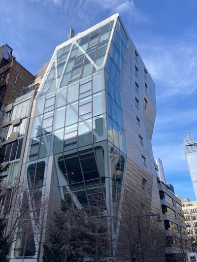
A few years ago after having been away from NYC for six months, and on my first day back in the city, I decided to take a walk on West 23rd Street. Approaching Tenth Avenue, I looked up toward the north side of West 23rd Street and noticed a very odd building. Gazing at it I felt that the building gave the impression of being drunk, like it was staggering and leaning back, intoxicated. Viewing it for a few minutes I started feeling dizzy.
Over the past ten years a number of new buildings have gone up around Manhattan that give the impression of vertigo to pedestrians passing by. The first question to ask is: What is going on with these architects? Are they rebelling against the vertical building? Have they been over-stimulated by CAD? It’s possible that the answer may be obvious if we consider the great success of the convention-breaking designs of Frank Gehry; for over fifty years he has been designing totally original structures that challenge traditional concepts of what a building should look like, and has been bringing into architecture a deconstructive style that no one else can match. His Guggenheim Bilbao is now an international icon of his style, resulting in numerous commissions coming his way.
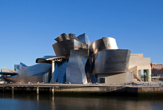 Frank Gehry, Guggenheim Bilbao
Naturally, influence can be viral like any informational form and Gehry’s influence spread quickly. Influence can have positive outcomes and show significant variations inspired by the original, and it can also add a touch of something different. With Gehry’s stylistic influence something different doesn’t seem to be the case. Rather, the direction of his influence seems to produce a mutated style of its own in which the misshapen and the peculiar are the intention. If this is the intention, then we may have to speculate that these architects studied at the Buster Keaton Academy of Architecture. (Keaton Film: One Week, 1920)
All of these imitators only prove that Gehry is fresh in his approach and sees the non-conforming building as a platform for innovation and creativity. No doubt Gehry, in his development as an architect, was absorbing influences as well, and it is quite apparent that he spent a lot of time in art galleries and museums looking at sculptures that clearly have the potential to be a building. His Bilbao Guggenheim, for example, shows a profile that reveals a very close resemblance to Boccioni’s sculpture Development of a Bottle in Space. If this is intentional we may never know, however the implication is very tempting.
 Boccioni Sculpture, Development of a Bottle in Space
Influence will always be simply what it is: a good piece of art or architecture that will inspire someone to emulate it by paying homage to it and echoing its look. But influence is something that is very fluid and undergoes its own transformation when being applied to art or architecture. Influence can get over-creative or under-creative, sloppy or too precise, and what one person sees in a work of art is not what another will see.
Why do architects who are influenced by Gehry seem to get it so wrong?
The first thing that looks off about the drunken building is that the architects continue to try to adhere to a standard four-wall building, the rectangular box model. This is not the kind of internal restructuring that Gehry does. He conceptualizes his buildings from the inside out. In his structures the volumes and planes of walls and roofs are moving around an axis or moving in surface waves. This is a sculptural approach. There is no doubt Gehry sees his work as a form of building sculpture. His own residence in California is a perfect example of his vision. When first encountered by someone not informed about Gehry’s architecture, the house is thought to be under construction; wood beams are openly displayed and plywood walls are visible. Corrugated metal is employed along with cyclone fencing that could easily give the impression of a temporary structure. These materials and structures echo sculptures by1960’s artists including Mark di Suvero, Bill Bollinger, David Smith, and other structural materialist sculptors who used materials in tensions set against each other to produce spatial volume and recesses that delineate a central structure.
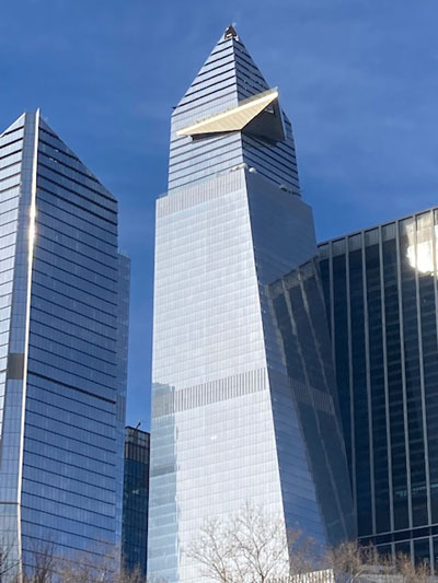 30 Hudson Yards
The drunken buildings we find in New York City are not about this kind of sculpted structure. Rather, as stated earlier, they take the standard building cubic volume and literally push it to a non-vertical position as in the 30 Hudson Yards building. This building is one of the tallest in Hudson Yards and features a glass floor observation deck. Nicknamed the Big Bird by local residents, it looms up and twists in a disorienting manner. Another example is 53 West 53rd Street, a Jean Nouvel building where MOMA is located: it has a profile that swerves out at the bottom and swoons backward like a phantom. However, one of the outright funniest buildings under construction in Manhattan is on 18th Street and the West Side Highway, right next door to a Frank Gehry building. This apartment building lurches to the right in an alarming manner and is met by a second building doing the same in the opposite direction. They offer a cartoon image that should serve as a poster for Drunken Architecture. Serious architecture may be over, but if comic architecture is now the vogue then we have to thank Gehry for helping architects get it wrong and giving us a laugh in the process. Frank Gehry is now the most influential architect of the last fifty years, but his legacy will be multifaceted and debated for many decades. Is it art or postmodern Funk as structure?
Manhattan is undergoing the most intense development since the early decades of of the twentieth century. It can be said without exaggeration that development is out of control. Buildings are going up all through the Big Apple with particular focus on the west side. The compulsion to keep New York new is not only a collective psychological symptom, it is also a huge business. The enormous amounts of money to be made in redeveloping New York have created the hottest real estate site in the USA.
There is a history of structures and buildings that make viewers dizzy. The Eiffel Tower, at the time of its construction the tallest structure in France, was thought to be a bizarre waste of resources and a vertiginous experience to view from below or from the lofty height of over one thousand feet.
Another example is Frank Lloyd Wright’s Guggenheim Museum. When it was completed the wave of critical opinions was enormous. It was likened to a hat box, a toilet, and a parking structure. Its round winding floor plan could cause one to become confused as to where the door was located or if the building was leaning to one side.
Buildings have always been a primary focus of human consciousness from the beginning of recorded time and even earlier in recorded biblical time. The most important example of this is the Tower of Babel, in which the descendants of Noah decided to build a huge towering structure to avoid another flood. God heard about this and didn’t like it. (Imagine the chutzpah of those humans thinking they can outsmart God.) As the story goes, the descendants of Noah all spoke the same language, which one we are not sure of, but God decided to end that unified language and caused the people to speak different languages, and therefore they could not understand each other and work on the tower was halted. In this tale the first skyscraper was conceived, which goes to show how ambitious God’s children could become.
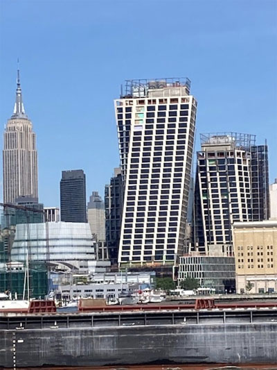 18 Street and Westside Highway
Innovation in architecture is not easy. There are standard conventions of building design that take into account materials and techniques and the functions the building is to perform. Innovations requires breaking rules or stretching them to come up with something fresh or novel. Yet, architecture is not an experimental profession. A building has to be safe and allow people to feel comfortable whether they live or work there.
The Modernist architecture of the Bauhaus represented a deductive form of thinking that sought the essentials of building design, the simple elegant solutions. This style became iconic and evolved into what was termed the International Style, and many architects adopted the ”Less is more.” credo that simplicity is beauty. Gehry’s architecture can be viewed as the opposite of unadorned, elegant design; he chose a creative approach that is almost experimental in it’s innovations.
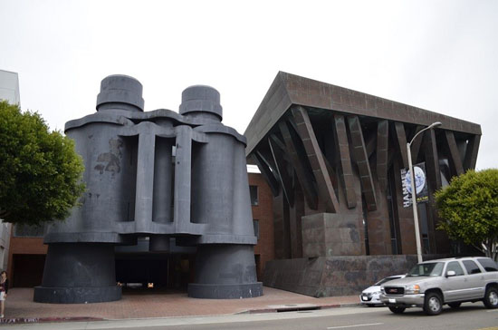
In taking such a position, he risks not having his work taken seriously as architecture at all. And apparently this doesn’t bother him or the people who want a building designed by him. To confirm this creative license, he had a colleague of sorts who was a very active and famous Pop artist, Claes Oldenburg. Since the1960’s Oldenburg had seriously proposed buildings that were in the form of girls’ legs or British electric plugs. Gehry appreciated Oldenburg’s idea that any object could be a building and acknowledged this influence in his Venice, California structure in which he collaborated with Oldenburg by including in his design a large entrance structure in the form of a pair of binoculars. The association with artists gave Gehry’s approach to architecture an art context, an idea that made allowances for creative license and taking chances.
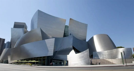 Walt Disney Concert Hall, Los Angeles California
But when it comes to architecture that looks drunk and makes us dizzy: do Gehry’s buildings do this too? If we take the example of the Walt Disney Concert Hall in Los Angeles, the overall facade is like a moving collection of spatial planes. It feels very sculptural and reminds us of forms used by sculptors of the 60’s like Roy Gussow, who developed a series of forms that moved in space and were coated with shinny nickel, or the English sculptor Anthony Caro whose sculpture Cascade has a very close affinity to Gehry’s building facades. Clearly, it seems very reasonable to say that Gehry was more influenced by art than he was by other architects. As he has stated, “98% of everything built today and designed today is pure shit.” and “Those of us working on our own thing are rare..leave us alone.” These statements sound like an artist speaking.
◊
Ron Morosan is an artist, writer, and curator. He has shown his work internationally at the American Pavilion of The Venice Biennale and the Circulo De Bellas Artes in Madrid, Spain. In the US he has shown at the New Museum and had a one-person exhibition at the New Jersey State Museum, and at numerous galleries in New York. He curated the Robert Dowd exhibition, Subversive Pop, at Center Galleries in Detroit, as well as Denotation, Connotation, Implication at Eisner Gallery, City University of New York. He has written catalogues for many artists, including Enid Sanford, Tom Parish, Robert Dowd, and others. In the 1990’s he started and ran B4A Gallery in Soho, New York, writing press releases, articles, and catalogues.
Read other articles by Ron Morosan on Arteidolia→

